Composition and Permanence
Rublev Colours Watercolors
 Rublev Colours Watercolors are made with the same pigments used by watercolor masters of the 17th to 19th centuries. The colors are genuine single pigment paints available individually in tubes and cakes.
We make Rublev Colours Watercolors in small batches using gum arabic and sugar syrup, which were the basic ingredients in watercolors of past centuries. There are no other additives to alter the characteristics of each color. Rublev Colours Watercolors do not contain fillers to extend colors, dispersants to disperse and granulate pigments, and brighteners to intensify colors. Instead, each color is crafted to develop its unique character, so they behave much the same as the colors of past masters.
Color Swatches
We have provided color swatches of Rublev Colours Watercolors to assist in making color choices and indicate each color’s behavior.
 |  |  |  |  |  | |||||
| Azurite | Smalt | Prussian Blue | Verditer Blue | Maya Blue | Key |
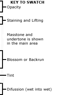
Note: Colors swatches are shown in mass tone at the top, mixed with an equal amount of water, and brushed out toward the bottom. All pictures of color swatches on this website are only approximations of the actual color of the watercolor paint. We have carefully matched the color in these pictures on calibrated color monitors to the actual color. However, your results may vary because of the wide variance in color monitors.
The following is an explanation of the following properties:
Opacity and Transparency
At the top of each swatch, the watercolor has been applied at full strength to show the maximum opacity of the pigment.
In the swatches above, Verditer blue completely obscures the top black line drawn in ink on the watercolor paper. This is apparent by comparing it to the second line drawn below, on top of the swatch after it dried. By comparison, there is no apparent masking of the lines drawn on the paper (difference in lightness between the line above and the line below drawn on top of the swatch) in Maya blue. Transparency ratings for the swatches above: Azurite = SO (semi-opaque), Smalt = ST (semi-transparent), Prussian Blue = ST (semi-transparent), Verditer Blue = O (opaque) and Maya Blue = T (transparent).
Staining and Lifting
All pigments stain paper but vary in how much of the pigment can be removed with a cotton swab. Prussian blue is one of the most extreme staining paints. Azurite and smalt are both mostly lifted. Staining ratings for the swatches above: Azurite = L (lightly staining), Smalt = L (lightly staining), Prussian Blue = H (heavily staining), Verditer Blue = M (moderately staining), and Maya Blue = L (lightly staining).
Granulation
The “thin” color areas of the swatches and the diffusion tests below them reveal differences in “texture” due to the appearance of visible pigment particles in the applied color, especially when the paint is diluted and applied with a wet brush. Both azurite and smalt show greater texture, caused by the difference between coarse and fine pigments than the other swatches. Granulation ratings: Azurite = H (heavy granulation), Smalt = L (heavy granulation), Prussian Blue = N (no granulation), Verditer Blue = M (moderate granulation) and Maya Blue = N (no granulation).
Blossom
Blossoming is the amount of flow when a partially dried swatch is brushed with clear water (at the bottom of each swatch). This tests the hydrophilicity (attraction to water) of the pigment particles, the solubility of the vehicle after it has dried, and the ease with which the paint can be manipulated in washes. Blossom ratings: Azurite = L (light blossom), Smalt = L (light blossom), Prussian Blue = H (heavy blossom), Verditer Blue = M (moderate blossom) and Maya Blue = H (heavy blossom).
Diffusion
The amount of paint flows in a puddle of clear water (painted horizontally at the bottom of the test swatch). This is measured as the horizontal distance the pigment travels from left to right. Most earth pigments do not wet well by water and hence do not diffuse when used wet in wet. Diffusion ratings: Azurite = L (light diffusion), Smalt = L (light diffusion), Prussian Blue = H (heavy diffusion), Verditer Blue = M (moderate diffusion) and Maya Blue = H (heavy diffusion).
Composition and Permanence
The Composition and Permanence tables in the description of Rublev Colours Watercolors provide important information on the composition, characteristics, and permanence of Rublev Colours color ranges. Using the tables helps you choose colors based on how they will appear and how long-lasting the finished artwork will be, and by understanding exactly what’s in your paint, you can be sure to create the highest quality painting.
The term ‘permanence’ is used here to mean the quality of lasting or remaining unchanged indefinitely. This does not imply that it will remain unchanged forever, but rather for an extended period that cannot be measured.
Color
This is the name of the color. This name usually indicates the name of the pigment; however, in pigment mixtures, the name is a designation of the mixture.
Pigment Classification
This is a classification of the pigment types used in each color. Pigments can be classified as being either Synthetic or Natural and Organic or Inorganic. For example, titanium white is Synthetic and Inorganic. Yellow ocher is Natural and Inorganic.
Colour Index Name
Each pigment can be universally identified by its Colour Index Name. For example, Cobalt Blue is Pigment Blue 28, abbreviated to PB 28.
Colour Index Names of the pigments allow you to cross-reference the functional properties in other sources, i.e., lightfastness, opacity, toxicity, etc. It is also necessary to fully identify some modern pigments; for example, disclosing a pigment as Naphthol Red is insufficient because there are over a dozen different types, differing widely in lightfastness and opacity.
Chemical Composition
This column provides the chemical description of the pigments used in each color.
Code
This Code is a number that is given to each of the colors. This is mainly used as a reference by retailers and in our literature, but it can also help you to find the right color when buying paint.
Series
The Series number indicates the relative price of the color and is determined mainly by the cost of the pigment. Series 1 is the least expensive, and Series 5 is the most costly.
Opacity
Transparent colors are marked ‘T’ and semi-transparent ‘ST.’ Opaque colors are marked ‘O’ and semi-opaque ‘SO.’ Transparency, however, is relative, and the ratings are provided as a guide only. In addition, any thin film of paint will appear more transparent than a thicker one.
Staining
Staining is the characteristic that makes color challenging to remove from the paper after it has been applied. Less staining colors can be removed almost entirely when wet or when rewetted, then lifted with a clean, wet brush and blotted up with a paper towel. Staining largely depends on the paper and the particle size of the pigment. Dispersants increase staining because they embed pigment particles in the fibers of the paper, dulling the finished color. While most brands of watercolors contain dispersants, Rublev Colours Watercolors do not; so staining is minimized.
Granulation
Granulation is the appearance of visible pigment particles in the applied color, especially when the paint is diluted and applied with a wet brush.
Flocculation
Flocculation is the clumping together of pigment particles, typical of some colors, such as lapis lazuli. Both granulation and flocculation create subtle effects as the paint dries and are considered desirable by accomplished watercolorists. The trend in commercial watercolors is to suppress pigment textures in favor of homogeneous washes of color. Many of the pigments used in Rublev Colours Watercolors are composed of large particles and naturally produce granulation effects without additives.
Permanence
The permanence of an artist’s color is defined as ‘its durability when laid with a brush on a support and displayed under a glass frame in a dry room freely exposed to ordinary daylight and an ordinary urban atmosphere.’
In simpler terms, the rating is the resistance of a color or color mixture to change when exposed to light and the atmosphere. Our ratings consider the following factors; the natural passage of time accelerated tests for lightfastness and binder stability and results from pigment manufacturers’ testing, making our permanent ratings the most stringent in the industry.
| Rating | Explanation |
| A | Permanent |
| B | Moderately Durable |
| C | Fugitive |
For further information on some colors, the rating may include one or more of the following additional notes:
| Notes | Explanation |
| 1 | May fade when applied in thin layers or washes. |
| 2 | May darken when exposed to damp conditions or high relative humidity. |
| 3 | Bleached by acids or acidic atmospheres. |
| 4 | Fluctuating color that fades in light but recovers in the dark. |
| 5 | Should not be prepared in pale tints with white, as these will fade. |
| 6 | May fade unless protected with an isolating varnish or fixative. |
Lightfastness
Lightfastness is shown with an ASTM rating for the pigment. The ASTM abbreviation stands for the American Society for Testing and Materials. This organization has set standards for the performance of art materials, including a color’s lightfastness. In this system, I is the highest lightfastness available, and V is the lowest, though ratings I and II are considered permanent for artists’ use.
To measure lightfastness using this system, colors are reduced to 40% reflectance by adding titanium white, except for watercolors, which rely on white paper. This means the amount of light reflected from the color swatch. The swatches are then tested in both sunlight and artificially accelerated conditions.
Where no ASTM rating is given for a color, it is labeled as ‘N/L’ meaning “Not Listed” this usually indicates that the ASTM has not yet tested the pigment. It does not necessarily imply a lack of lightfastness.
In these cases, we recommend you refer to the permanence rating, which evaluates color on many aspects, including lightfastness, and is used to indicate a color’s ability to resist fading.
